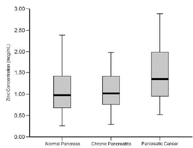
Figure 1.
Comparison of zinc concentration in pancreatic fluid. Data is illustrated in box-and-whisker plot. Box represents the median and interquartile range. Whisker line represents the maximal and minimal distributions of data set. (mcg = μg)